
One of the most common mistakes small business owners make with their website is underestimating how many of their visitors are on a mobile device, and not a desktop. Over half of the potential customers that land on your website are on their phone. Even today, mobile websites see by far the highest bounce rate (the rate at which a visitor lands on your website, and ultimately leaves and moves on), compared to other devices. We’re going to dive into the reasons for this, and where you should focus your attention, to ensure your website is capturing the conversion that you deserve.
Be forewarned, this article contains a healthy dose of geek-speak, but we’re going to also explain why you, the business owner, should care. From there, you can feel free to pass this article off to your web developer to take over.
Experience your own mobile lead journey
It’s a well-known fact that internet users are short on patience. Mobile internet users? Even more so. Your potential customers seek the path of least resistance when it comes to finding what they are looking for, so your objective (and ours) is to give them what they want.
Your website should clearly and concisely communicate what it is your business has to offer. It should provide a clear action path for the visitor should they wish to learn more about your business, or otherwise get in touch with you. This becomes even more delicate when scaling your website down to a 5-inch screen. Your content and buttons need to be placed with intention, otherwise the visitor may hit the back button. Here are some tips you (or your web developer) should be following to ensure higher retention:
Useful Tips:
- The visitor should see exactly what your business does as soon as they land on your website, without needing to scroll.
- Use buttons that stand out.
- Use call to action text that makes the action of the visitor clear.
- Use shaped buttons, not text-only.
- Buttons should be placed in the “thumb zone” - areas of the screen that the thumb can easily reach.
- Clear your mind, put yourself in the mindset of your potential customer.
- Load up your website on your phone.
- Get acquainted with your business and browse as you naturally would.
- Now, think of all of the reasons a potential customer might hit the back button and move on.
- Rinse and repeat, going through various possible journeys visiting a variety of pages, taking notes along the way.
- Finally, ask a family member, friend or your spouse to follow the same steps. Ideally, ask a variety of folks with different personalities.
- By this point, you may have an amazing mobile experience already, but more than likely you have a list the size of your arm of action items that you can graciously hand over to your web developer.
Nobody knows your business or your demographic like you do, so taking the time to see things through the lens of your potential customer can make the world of difference to the finished product of your website.
Use tools to monitor how your website is performing
Though the idea of monitoring your website’s traffic may sound daunting, once you know what to look for, you’ll wish you started doing it sooner. We highly recommend setting aside some time to check out this crash course on Google Analytics. We promise the 36-minute time investment will get you on track to understanding how your visitors are using your website. Oh, and make sure you come back here after. We’re not done yet.
Now that you have Google Analytics set up on your website (or if you don’t, do it right after reading this article), make sure to give it a least a month to monitor the traffic of your visitors. Tools such as Google Analytics allow you to gain actual insights into the journey your potential customers are experiencing prior to ultimately buying your product, requesting more details, or otherwise leaving and moving onto a different website.
Here are some things you should be looking out for:
- What pages are your visitors spending the most/least time on?
- Are your most popular pages in alignment with your core services?
- Which pages have the highest bounce rate?
- Which pages have the highest conversion?
Monitoring these things can allow you to make informed decisions on where your website’s mobile experience (or desktop for that matter) has room for improvement.
Use images and other bulky content sparingly
It’s true, the right image can make a design go from good to great, but that doesn’t mean you should go all willy-nilly with images. Images can take up considerably more space than the code required to load your website, and will ultimately become files that every website visitor must download before they can view the web page.
Now in the context of the mobile world, your visitors may have a shoddy 3G connection or a data cap with their ever-so-lovely service provider. An image heavy website can be the difference between a potential customer making it to your website, and otherwise abandoning it before it even fully loads.
As such, it’s important to stay in the habit of using images sparingly and intentionally. Here are some tips that we follow, that you can either get to work on or add to your growing laundry list of action items for your web developer:
- Avoid using images over 500KB in size (300KB is even better).
- Avoid using more than 1MB of images on a single page (700KB is even better).
- Make sure your images are optimized for the web.
- Use modern web formats like WEBP to ensure optimal load time.
- Keep in mind that oftentimes simple, lightweight images can make just as positive an impact to your website as a larger image.
- Using photos taken on-site while your business was in action is totally fine, but again should be done conservatively and optimized for the web.
Alright, go grab some water, a coffee, or otherwise take a breather. We’re about to dive deeper.
Create Mobile, Tablet and Desktop Specific Content
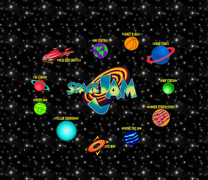
Oh how far the world wide web has come. Does anyone remember the old Space Jam website? Of course you don’t, so here’s your blast to the past for the day:
Let’s just say it like it is: we live in a world where almost everyone and their dog has access to a device. Fortunately, web standards have come a long way since that charming website displayed above was published. Through the use of some modern tricks that have evolved over the years, we can actually create parts of, or even entire pages that display only on the device it was designed for.
The particular trick we are referring to is called breakpoints. Breakpoints are a way to tell your device whether or not to load a specific thing depending on the size of the device’s screen. That being the case, if you have a section of your page that you really like, but doesn’t adapt to certain screens well, breakpoints allow you to have your cake, and eat it too.
Make sure your fonts scale well
Fonts – the unsung hero of modern web design. The complexity of scalable fonts falls outside the scope for this article, so we’re going to give you the bite-sized version to help you know what it is and why it’s important.
In a nutshell, to have “scalable fonts” simply means to have the text on your website adapt the amount of space it takes up on the page, depending on the size of the screen being used. For example, a large header on a desktop might take up far too much space if left as is on a phone screen. At the same time, we don’t want it to scale in direct proportion to the screen (a phone might be 1/5 the size of a monitor, but that doesn’t mean we want the header to be 1/5 the size). This is where scalable fonts swoop in and save the day.
As mentioned, this is a tale for another day, but hopefully your interest is piqued. Tune into our monthly newsletter where we make deep dives into topics like this one.
Lighten the load on your code
Since we’re aiming to keep this article easily digestible, we’re not going to dive into the details of how pages should be coded, but instead outline some concepts to build on your understanding so you know what to look out for.
Websites and their individual pages are built of many smaller components within. These components can be images, blocks of text, animations, containers that hold things, and so much more. The containers we mentioned even have the ability to “contain” any of the above-mentioned components – yes, including more containers. How many layers can it go, you ask? If we dare try to answer that it may get philosophical, and we’ll never finish this article.
In the world of a web designer, it can become really easy to get caught up making the website look perfect for the customer, so much that they forget about how clunky they might be making it in the process. If code optimization isn’t at the forefront of the team making your website, we can almost guarantee you it will not get the attention it deserves.
Fortunately for you, there are some simple tools you can use to see if your website is built with optimization in mind. One of the most common is Google’s PageSpeed Insights. Simply enter your website’s URL and click “Analyze”. You’ll see the results provide a ranking for both your website’s mobile optimization, as well as desktop (go figure, they prioritize mobile!).
Heads-up:
Don’t fret if your website doesn’t score 100. Even Google.com doesn’t score 100. We know, kind of ironic, but anyway. Depending on the type of website you are scoring (highly complex ones will tend to score lower), anything over 80 is what you should consider acceptable. Higher than that is definitely possible to achieve. In most cases, it may just require you (or your web developer) to get creative with optimizations. If you’re in the mood for that, check out our article on 5 ways to make your website load faster.
Conclusion
The fact that you’ve made it this far tells us that your visitor’s mobile experience is important to you. Though it takes a conscious effort to maintain a strong mobile experience on any website, the fundamentals outlined in this article will come more naturally with practice.
If all of this seems like a bit more than you’d prefer to manage on your own, our team of Website Experts is always available to help. Simply contact us, or book a free website consultation to help us assess your needs.


